
Color Palette Choices for Minimalist Homes
Choosing the right color palette is essential when creating a minimalist home. Minimalism thrives on clarity, openness, and a sense of serenity, all of which are strongly influenced by the colors used in a space. A thoughtfully selected palette not only enhances the aesthetic appeal of a room but also helps in crafting a harmonious, clutter-free environment. Below, you’ll discover how to navigate color choices that best complement a minimalist lifestyle.
Understanding the Essence of Minimalist Color Schemes
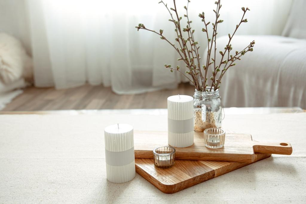
Neutrals are central to minimalist interiors because they establish a calm, undistracted atmosphere. A palette grounded in shades like white, ivory, beige, or soft gray ensures that the architecture of the home and carefully chosen furnishings remain the focus. Neutrals offer a sense of continuity from room to room, visually expanding spaces and allowing light to bounce freely. They also create a timeless backdrop that makes adding or changing small accents exceptionally easy without disrupting the overall cohesiveness. For those seeking serenity and longevity in their interiors, neutrals are an indispensable starting point.
Finding the Right Shade for Every Room
The Role of Natural Light
Natural light dramatically affects the appearance of colors in minimalist spaces. South-facing rooms, bathed in warm sunlight, tend to make colors appear brighter and more vibrant, while north-facing spaces often have a cooler, dimmer quality that can render some hues dull or cold. When curating a minimalist palette, it’s crucial to test colors in different lighting conditions throughout the day. Pale shades can help amplify light and make compact spaces feel open, whereas deeper neutrals might add intimacy to larger rooms without sacrificing the signature minimalist calm.
Customizing Palettes for Functionality
Different rooms in the home serve distinct purposes, and color choice should reflect their function. For example, a minimalist kitchen benefits from crisp whites or soft grays that suggest cleanliness and efficiency, while a living room might feel more welcoming with muted earth tones. Bedrooms, where rest is paramount, often call for the most subdued and tranquil shades. By tailoring color schemes to a room’s unique needs, homeowners can maintain a cohesive minimalist look that also supports everyday living and comfort.
Accent Colors in Minimalist Design
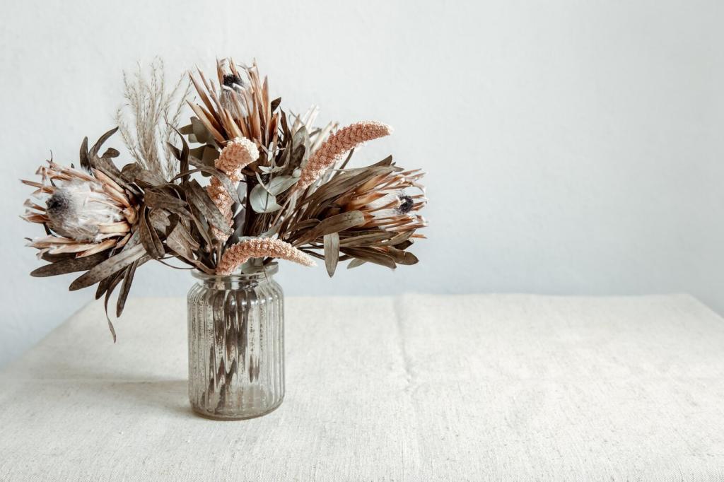
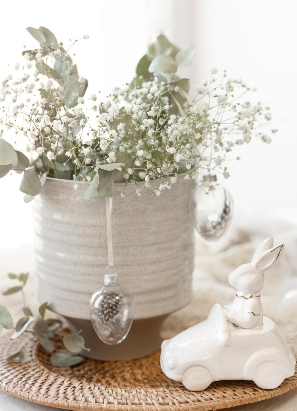
While the overall palette is often subdued, carefully chosen accent colors can inject personality and prevent monotony. In minimalist homes, accents are applied judiciously—a single piece of artwork, a subtly colored throw, or even a potted plant can become a focal point without disrupting the tranquility. Soft, nature-inspired colors like sage, dusty blue, or muted terracotta work well with neutrals, enriching the space while maintaining minimalism’s essence. When accents are used thoughtfully, they create moments of interest and warmth that reaffirm the home’s individuality.
Achieving Cohesiveness without Uniformity
Open floor plans are common in minimalist homes, and the way colors transition between these spaces is key to maintaining a cohesive atmosphere. Using variations of a single hue throughout the home allows for fluid movement between rooms, avoiding visual interruptions. This approach doesn’t require every room to be identical but encourages the eye to travel effortlessly across the space. Transition zones, like hallways or entryways, can be used to gently shift between color temperatures or materials, underscoring the home’s overall flow and unity.